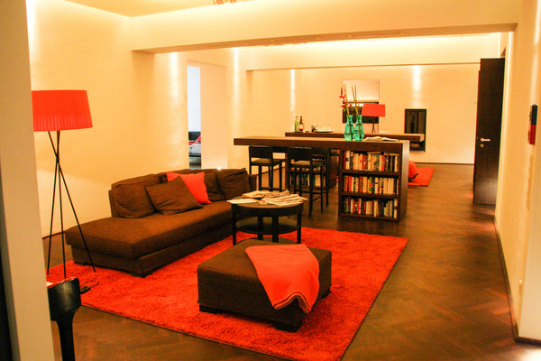
Lately I have become obsessed with the color orange. While trying to search out the perfect colors for Bungalow36 business card, I couldn’t help but pick orange as the dominant color. I was searching through some photos of Europe and I noticed my love for orange started after a stay at a hotel in Vienna called the
Hollomann Beletage.
This hotel has a cool modern style to it with dark espresso stained wood floors and splashes of chocolate and orange. They even included the color orange into the buttons in the pillows...fabulous! To top it off they had these vintage orange bikes that we rode all over Vienna. My husband and I had the best time discovering Vienna. I highly recommend it.


Now that my mind was made up with color orange I wanted to add another color into the card to give it a soothing feeling. I came across some photos I took in 2007 from a place called Nezezine, a little island off of Croatia. This was the most serene island we visited. There must be something in the air that diffuses the light because everything on the island had a mysterious glow to it. It's a painters paradise! As I was searching through all these beautiful photos I was drawn to this old rustic window. And right there... I got it! Pale blue and refreshing orange on beautiful white 100% cotton paper. I couldn’t have come up with a more perfect color combo that would carry across the feeling of what Bungalow36 is.

Here are the Bungalow36 business cards!!! I chose to print them on 220# Cranes Lettra paper. The texture of this paper feels like velvet. I love to design business cards with a different shape. The reason is to set myself apart from all the other cards out there. I think it gives you an edge to be clever and different. People walk away feeling like they just got something really cool. My cards always make people look twice and hopefully walk away feeling inspired.


